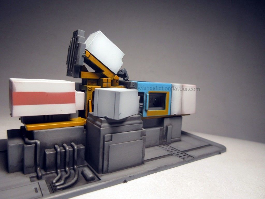
To mark Manufacturing Day 2026, a fitting subject was chosen: Bandai’s 1/60 Electromotive Style Injection Machine.
Rather than a Gundam or conventional mecha, this unusual hobby kit represents the industrial machinery used to manufacture plastic model kits.
From Black Plastic to Painted Machine
The kit consists of a single runner, with all parts moulded in black plastic. A silver “Ecopla” sticker is included on the box.
Initially, having the entire runner in one colour seemed likely to make the painting process more difficult. Without colour-separated plastic to provide guidance, the parts had to be studied individually and the colour allocation determined by observation.
This encouraged a more deliberate approach to the surfaces and finishing.
All parts first received an airbrushed base coat of Mr. Color No. 13 Neutral Grey.
Paint Allocation
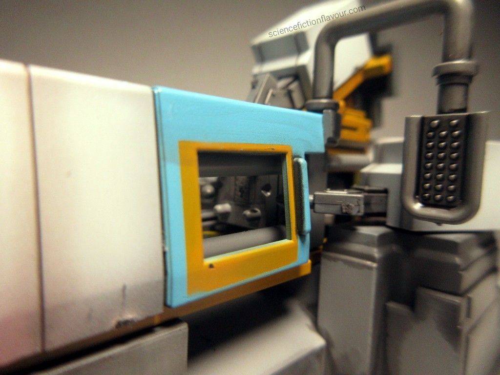
Parts 5 and 6 were base coated with Mr. Color No. 109 Character Yellow. The supplied stickers were repurposed as masking material to protect the areas intended to remain yellow before Mr. Color No. 323 Light Blue was airbrushed over the exposed sections. As the parts were thin, the Light Blue was applied as a uniform coat rather than heavily weathered.
The masking stickers were inadvertently switched between the two parts. Consequently, the yellow perimeter around the side-door window is thicker toward the lower section rather than the upper section. The result was left as it was.
Parts 14 and 15 also received Mr. Color No. 109 Character Yellow.
Part 19 was base coated with Mr. Hobby Gundam Color UG10 MS Char’s Pink. The pink area was masked before Mr. Color No. 107 Character White was applied to the exposed section.
Part 20 received a different treatment. Selected wall surfaces were first airbrushed with Mr. Hobby Gundam Color UG10 MS Char’s Pink, while others remained Mr. Color No. 13 Neutral Grey. Masking had initially been planned, but was abandoned in favour of weathering the entire part with Mr. Color No. 107 Character White. The White was airbrushed over the whole part, leaving pinkish and greyish tones visible around the outer rim of the weathered sections.
The remaining Neutral Grey areas were lightened with a mixture of Mr. Color No. 13 Neutral Grey and No. 107 Character White, adding tonal variation to the overall finish.
Panel Lining and Finishing
After airbrushing, Tamiya Panel Line Accent Color Black was applied to the moulded details. Excess was removed with cotton buds dampened with Tamiya X-20.
For the final assembly, the supplied stickers were deliberately left unused. This omits details such as the alphanumeric prefix, chamfered rectangular markings, and simulated vent lines.
The resulting minimalist finish keeps the focus on the machine’s forms, painted surfaces and restrained detailing.
A Machine Behind the Models
There is something appropriately circular about building a model of an injection-moulding machine.
Injection-moulding machine → plastic → model kit → modeler.
The machinery behind the hobby has itself become a model on the workbench.
For Manufacturing Day 2026, Bandai’s 1/60 Electromotive Style Injection Machine offers a different kind of model-building experience: one that turns attention towards the industrial process behind the hobby itself.
HGUC 1/144 Gundam GP01Fb “Zephyranthes” Full Burnern — LINKIN PARK: UNSHATTER Commemorative Build
With LINKIN PARK: UNSHATTER releasing on 30 September 2026, I decided to commemorate the occasion with a Gunpla build.
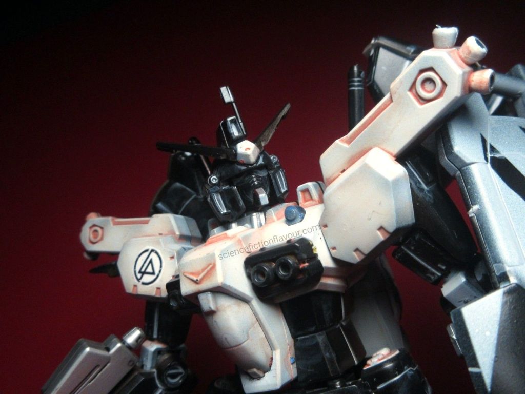
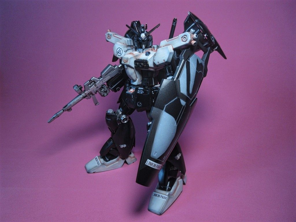
For this build, I worked on the HGUC 1/144 Gundam GP01Fb “Zephyranthes” Full Burnern, a Gunpla with an existing Linkin Park connection.
Painting
I started by airbrushing the parts while they were still on the runners with Mr. Hobby Mr. Color No. 2 Gloss Black.
Parts requiring bright colours received Mr. Color No. 107 Character White, while the grey parts were painted with Mr. Color No. 8 Silver. Parts intended to remain dark retained the Gloss Black.
I deliberately left the pre-2000 polycap runners unpainted. Their rubbery-like material made me concerned that paint might not adhere properly, potentially flaking off and causing problems with the joints.
Panel Lining
I used different Tamiya Panel Line Accent colours according to the base colour:
Character White — Pink-Brown
Gloss Black — Light Grey
Silver — Black
After allowing the panel liner to dry, I cleaned up the excess with cotton buds dipped in Tamiya X-20 Enamel Thinner.
Assembly and Decals
Assembly was straightforward.
Once the main assembly was completed, I applied the waterslide decals. The round Linkin Park logo was particularly important to the build, but I noticed that its ink had a tendency to crack or flake.
To protect the decal and the paintwork, I sprayed the completed model with Mr. Hobby Top Coat Semi-Gloss.
I would have preferred to retain the full Gloss Black shine, but protecting the decal was more important. The semi-gloss finish was a worthwhile trade-off.
Custom Shield
The shield was inspired by the silhouette artwork from A Thousand Suns.
I first masked and airbrushed the silhouette in Mr. Color No. 107 Character White, creating one continuous shape. Once the masking was removed, the complete album-art silhouette could be seen as one shape.
I then applied Tamiya Light Grey Panel Line Accent to the shield and cleaned the excess with X-20 Enamel Thinner.
The shield was deliberately the last piece cut from the runner. Once it was cut out, I test-fitted it onto the completed Gunpla.
However, this was not yet the final installation. I removed the shield again for a second masking stage.
For this stage, I used the original paper stickers supplied for the shield as masking material. The stickers covered the silhouette while leaving the outer rim/perimeter exposed.
I diluted Mr. Color No. 2 Gloss Black and airbrushed it over the exposed perimeter. After allowing the paint to dry, I carefully removed the stickers.
The result was the A Thousand Suns silhouette segmented into two sections, with the shield’s outer perimeter creating the separation.
The completed shield was then attached to the GP01Fb.
Final
This build brought together airbrushing on the runners, colour-specific panel lining, custom masking, waterslide decals and protective top coating.
The Linkin Park logo and the custom A Thousand Suns shield design give this GP01Fb its particular connection to the occasion.
I would have preferred to preserve the full Gloss Black shine, but protecting the decal and the completed model mattered more.
This was my personal Gunpla build to mark the release of LINKIN PARK: UNSHATTER.
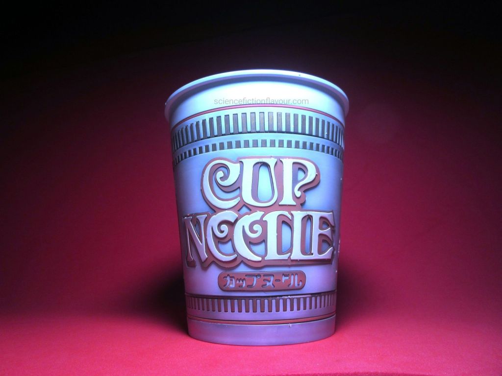
Kit: Best Hit Chronicle 1/1 Cup Noodle Manufacturer: Bandai Scale: 1/1 Completed: 18 September 2026
18 September 1971.
According to the instruction manual for Bandai’s Best Hit Chronicle 1/1 Cup Noodle, this was the date when CUP NOODLE was created as the world’s first cup ramen.
So there was something particularly appropriate about completing this kit on 18 September 2026 — exactly 55 years later.
At first glance, a 1/1-scale plastic model of a Cup Noodle might seem like a rather unusual modelling subject. After all, this is an everyday object that we see in convenience stores and supermarkets and probably don’t give much thought to once we have finished eating it.
Building the kit, however, made me look at that familiar object quite differently.
Painting the parts
I started by airbrushing the parts while they were still attached to their runners, using Mr Hobby Mr Color No. 13 Neutral Grey as the base coat.
I then applied different colours to the moulded parts:
White moulded parts: Mr Color No. 107 Character White
Red moulded parts: Gundam Color UG10 MS Char Pink
Gold moulded parts: Mr Color No. 9 Gold
Simulated noodles: Mr Color No. 109 Character Yellow
The noodle pieces received some experimentation of their own.
I tried Tamiya Panel Line Accent Color Pink-Brown on a sample section of the noodles. The panel wash settled into the texture of the noodle strands and produced a noticeably deeper, warmer appearance. Viewed on its own, it reminded me somewhat of the appearance of noodles in a bowl of laksa.
Since this kit represents Cup Noodle generally rather than a specific flavour variant — such as Curry, Laksa, Chicken or Seafood — I initially decided not to apply the same treatment to the remaining larger noodle pieces.
Interestingly, once the noodles were assembled into the Dense Noodle Cluster, the effect became much less prominent. The individual strands visually blend together, and the variation contributes more to the texture and depth of the noodle mass than to any particular flavour association.
The engineering behind the familiar graphics
Assembly itself was straightforward.
What I found much more interesting was discovering how Bandai reproduced something that we normally take completely for granted: the printed graphics on a Cup Noodle container.
On the real product, we see the artwork and coloured patterns as a continuous printed surface. On this model, however, many of those visual elements are represented by individual coloured-plastic-moulded parts.
The result is an extremely clean separation between colours.
The upper and lower sections are especially interesting. Several ring-like, almost hula-hoop-like subassemblies come together to form the overall printed pattern of the cup.
Once assembled, the eye sees the familiar Cup Noodle design. But looking closely at the model reveals the construction underneath that visual illusion.
It made me appreciate just how much engineering goes into reproducing something that otherwise looks like a simple printed cup.
Bringing the recessed lettering to life
The kit does come with sticker decals, but one particular area made me reconsider whether I wanted to use them.
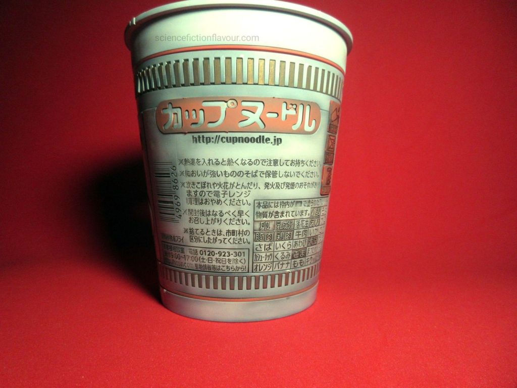
Part B(1) contains the nutritional information and paragraphs of Japanese text. These details are already represented as recesses in the plastic surface.
Since the lettering was already moulded into the plastic, I decided that applying the supplied sticker would obscure rather than enhance the detail.
Instead, I applied Tamiya Panel Line Accent Color Black, allowed it to settle into the recessed lettering, and then removed the excess from the surrounding surface using X-20 Thinner and a cotton bud.
The result was much more satisfying to me.
The black remained in the recessed areas, bringing the tiny Japanese text and nutritional information into view. What had initially appeared to be barely noticeable moulded detail became much more visible.
It felt less like applying a representation of the printing and more like revealing the detail that was already physically present in the model.
Choosing not to use the lid stickers
I made the same decision with the supplied Lid Sticker and Lid Stopper Sticker.
I ultimately left both off.
This wasn’t because the decals were poorly conceived. Rather, by this point in the build I had become increasingly interested in the physical construction of the kit itself.
The more I looked at the model, the more I wanted its moulded engineering, colour-separated components and recessed details to remain visible.
For me, that became part of what made this particular build interesting.
More than a plastic Cup Noodle
This kit also made me think about the difference between the price of an everyday product and the value of the engineering behind it.
A Cup Noodle is, ultimately, an inexpensive food product. We buy it, prepare it, eat it and throw away the container.
The Best Hit Chronicle kit takes that familiar disposable object and turns it into something that we examine, assemble and preserve.
And in doing so, it exposes some of the engineering that is normally hidden from us.
The real Cup Noodle’s graphics appear to be simply printed onto the cup. The model reveals that those visual elements can be broken down into multiple physical components and carefully assembled to recreate the appearance.
The recessed lettering on B(1) is another example. On the real product, it is simply part of the printed packaging. On the model, the lettering exists as physical geometry in the plastic.
The real Cup Noodle hides its construction behind its familiar appearance. The model kit makes some of that construction visible.
That is probably what I appreciated most about building it.
Rather than simply reproducing the appearance of a Cup Noodle, Bandai has created a 1/1-scale model that lets the builder examine how that appearance can itself be constructed.
55 years later
Completing the model on 18 September 2026, 55 years after the date given in the instruction manual for the creation of Cup Noodle, gives the build an additional significance.
It is still a playful subject — after all, it is a plastic model of a cup of noodles.
But it is also a small examination of an everyday object that has become deeply familiar.
The finished model now sits as a permanent, plastic representation of something that was originally designed to be consumed and discarded.
And perhaps that is the charm of the Best Hit Chronicle series.
It encourages us to look again at objects that are so familiar that we normally stop noticing them.
For this Cup Noodle, that meant looking past the printed graphics, past the noodles and even past the food itself — and appreciating the design, moulding and engineering that make the familiar object possible.
18 September 1971 → 18 September 2026.
55 years of Cup Noodle, commemorated in 1/1 scale.
Building Bandai’s Figure-rise Standard ULTRAMAN SUIT JACK -ACTION- – An Ultraman Day 2026 Project
Published: 10 July 2026 – Ultraman Day
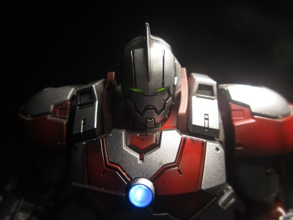
To mark Ultraman Day 2026, I spent the past few days working on Bandai’s Figure-rise Standard ULTRAMAN SUIT JACK -ACTION-. Rather than building it straight out of the box, I gave the kit a complete painted finish, weathering, panel lining, and a working LED Unit Dual Type [White_Blue/Red] before final assembly.
This article documents the steps I took to prepare, paint, detail and complete the model, from the initial base coating of the runners through to the final illuminated build.
Preparing the Parts
After unpacking all of the runners, I began by airbrushing a dark base coat onto the solid-coloured moulded parts. This undercoat helped create greater colour depth and served as the foundation for the subsequent paintwork.
With the base coat completed, I proceeded to paint the individual sections according to their intended finish.
The red armour pieces were weathered using Mr. Hobby Mr. Color 108 (Character Red), giving the armour greater depth and subtle tonal variation.
The grey armour components received an airbrushed coat of Mr. Hobby Mr. Color 13 (Neutral Grey), creating a consistent finish across the mechanical sections.
For the metallic components, I airbrushed Mr. Hobby Mr. Color 159 (Super Silver) over the dark base coat, producing a metallic finish that looked richer and more convincing than the original silver plastic.
The kit’s clear blue and clear yellow parts were left unpainted to preserve their original appearance and allow the coloured plastic to complement the finished model.
Panel Lining
After all the painted parts had dried thoroughly, I applied Tamiya Panel Line Accent Color (Black) to the recessed panel lines and mechanical details.
The panel line accent was then left to dry overnight before I carefully removed the excess using cotton buds lightly moistened with Tamiya X-20 Enamel Thinner. This process helped define the armour details while maintaining a clean finish.
Assembly
With the painting and detailing completed, I began assembling the kit.
Like many modern Bandai releases, the entire model is a snap-fit kit. The parts fit together tightly and securely, making assembly straightforward without requiring glue.
Partway through the build, I noticed that the instruction manual included the option to install Bandai’s LED Unit Dual Type [White_Blue/Red].
Wanting to take advantage of the feature, I obtained a pair of LR41 button-cell batteries and prepared the LED unit using a small cross-head screwdriver before installing it into the model during assembly. Once powered on, the illuminated chest added another level of realism to the completed model. It was a simple enhancement, but one that complemented the mechanical design of ULTRAMAN SUIT JACK remarkably well.
Final Thoughts
The Figure-rise Standard ULTRAMAN SUIT JACK -ACTION- proved to be an enjoyable project from start to finish. Although the kit already features excellent engineering and impressive articulation, the additional painting, weathering, panel lining and LED installation helped transform it into a model with a more realistic mechanical appearance.
As always, it’s satisfying to see all the preparation—from painting individual runners to carefully cleaning up the panel lines—come together during the final assembly. The completed model captures the imposing presence of ULTRAMAN SUIT JACK, while the illuminated chest provides an eye-catching finishing touch.
Completing this project on Ultraman Day 2026 made the build even more meaningful. It was a fitting way to celebrate Ultraman’s enduring legacy while enjoying another rewarding scale modelling project.
I recently completed Bandai’s PokéPla Mew plastic model kit, but instead of building it straight out of the box, I pushed it in a more stylised direction using airbrush work, selective colour treatment, and panel lining.
The goal was to move away from the clean, toy-like finish and explore a more muted, weathered interpretation of the character while still preserving its recognisable form.
Materials and Paints Used
For this build, I worked with a combination of airbrush and hand-detailing materials:
•Airbrush setup •Mr Hobby Mr Color No. 18 (RLM70 Black Green) •Mr Hobby Mr Color No. 112 (Character Flesh 2) •Mr Hobby Mr Color No. 110 (Character Blue) •Mr Hobby Mr Color No. 107 (Character White) •Pink permanent marker •Tamiya Panel Line Accent Colour (Black) •Original kit stickers (used as masking aids for eye detailing)
Base Coating the Entire Kit
The first step was to unify all parts using an airbrushed base coat of Mr Color 18 (RLM70 Black Green).
This immediately changed the character of the kit, removing the bright factory colours and replacing them with a darker, more cohesive foundation. Instead of preserving the original colour separation, I chose to reset the visual tone entirely and rebuild contrast through subsequent layers.
Colour Modulation and Surface Variation
With the base coat in place, I began introducing subtle variation across different areas of the model.
The beige moulded parts were weathered using Mr Color 112 (Character Flesh 2). This added a soft tonal shift that remained within the darker overall palette while helping break up uniformity.
For the orange sections, I applied a pink permanent marker, slightly adjusting the tone and pushing it toward a more stylised finish. This created a subtle visual accent and prevented those areas from blending too heavily into the dark base coat.
Eye Detailing and Masking Technique
The eyes were treated as a focal point of the build and received more precise detailing work.
Using Mr Color 110 (Character Blue) and Mr Color 107 (Character White), I painted the eye areas while using the kit’s included stickers as temporary masking guides.
This method allowed for cleaner separation between colours and helped approximate the intended eye shapes without requiring custom masking tape or decals. Despite the small scale, it provided enough control to keep the detailing sharp and readable.
Panel Lining for Depth and Definition
Once all paint layers had fully cured, I applied Tamiya Panel Line Accent Colour (Black) to the recessed panel lines and sculpt details.
This step significantly enhanced depth and readability, especially after the darker base coat reduced natural contrast. The panel lining reintroduced structure to the form and helped define edges and internal contours across the model.
Final Result
The finished Mew presents a noticeably different interpretation from the original kit design.
The combination of a dark airbrushed base, selective colour modulation, and panel lining transforms it from a bright, soft character figure into a more subdued and atmospheric display piece. While it still reads clearly as Mew, the overall impression is more grounded and stylised.
This build also served as an experiment in how far a simple PokéPla kit can be pushed using basic modelling techniques, and how dramatically mood and character can shift through paint alone.
A Quiet Milestone
The build was completed on 6 July 2026, the 10th anniversary of Pokémon GO, adding a fitting contextual layer to a Pokémon-themed project. It quietly links a physical model build to one of the franchise’s most culturally significant modern milestones.
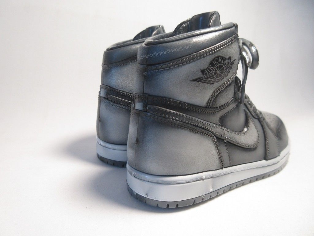
Building the Bandai Nike Air Jordan Plastic Model Kit
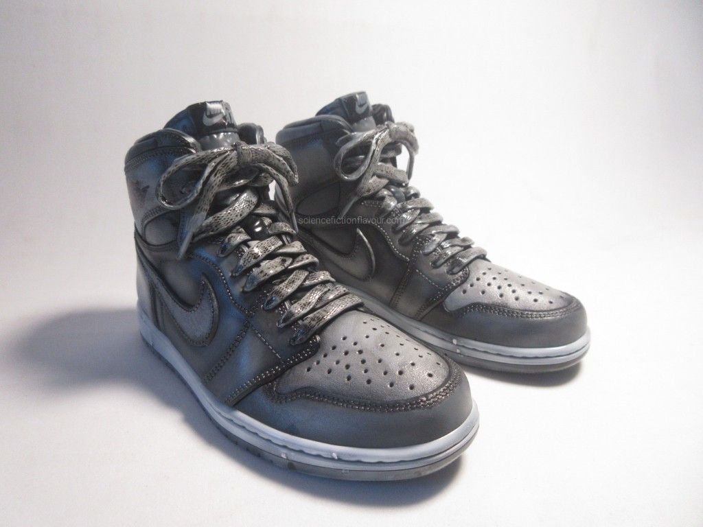
This project is a reinterpretation of the Bandai Nike Air Jordan plastic model kit, approached not as a clean display build, but as a subtly worn sneaker object. The goal was to sit between scale modelling and product design — capturing material depth, tonal variation, and light ageing without pushing the piece into an overly artificial or exaggerated weathered state.
Design Direction
The kit provides multiple colour directions across its runners, including a grayscale-based scheme and an alternate variant with beige-toned elements.
For this build, I chose to focus on the grayscale direction to maintain a more unified visual language. This allowed the final piece to emphasise material contrast, weathering variation, and surface depth within a restrained palette.
Base Preparation
All parts were first airbrushed with Mr Hobby Mr Color No. 2 as a unified base coat. This created a consistent foundation across the different plastic tones and ensured that subsequent weathering would behave coherently across all surfaces.
Weathering Approach
Rather than applying a single universal weathering tone, I treated each injection-moulded colour as a different material requiring its own interpretation. The intent was not to simulate heavy damage or dirt accumulation, but to introduce subtle ageing — similar to how real sneakers develop uneven wear across different materials.
Black Injection-Moulded Parts
Weathered using Mr Color No. 13, producing a softened, slightly faded rubber-like appearance.
Grey Injection-Moulded Parts
Weathered using a custom mix of Mr Color No. 13 and No. 107, balancing contrast while maintaining a muted, dusty tone.
White Injection-Moulded Parts
Weathered using Mr Color No. 107 to create a lightly aged midsole-like effect.
Panel Line Detailing
After weathering, Tamiya Black Accent Fluid was applied to bring out recessed details and structural lines across the model. Once dried, excess fluid was cleaned using thinner and cotton buds, leaving definition in the panel lines while preserving surface softness. Unlike traditional mechanical model kits, the panel lines in this context function less as structural separations and more as stitched seams, material joins, and subtle shadow breaks within the sneaker design.
Final Impression
The overall aim of this build was to maintain a balance between fashion object and scale model. Rather than pushing the surface treatment toward a heavily mechanical or overly aggressive weathering style, the focus remained on controlled tonal variation and material realism.
The result is a sneaker model that feels lightly worn and physically grounded, while still retaining the clarity and design language of its original form.
Project Context
Completed on 30 May 2026, the project coincides with the 55th anniversary of Blue Ribbon Sports being renamed Nike in 1971. The timing served as context for reinterpreting the Air Jordan silhouette as a scale model object shaped through material treatment, tonal restraint, and subtle surface ageing.
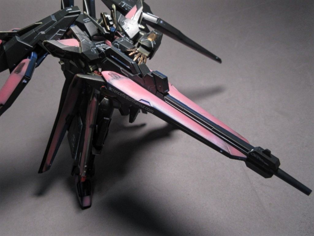
This project was undertaken as a personal tribute piece to commemorate 10 April 2026, alongside the release of Children of the Sun. Following an earlier Freedom Gundam + Meteor Unit build, this iteration explores what a modern “successor” to Freedom might look like through a Phantaci-inspired aesthetic.
Paintwork & Colour Concept The build began with a full base coat applied directly onto the runners using Mr. Hobby Mr. Colour No. 18 (German Aircraft Grey). This provided a neutral, slightly industrial tone that would later contrast well with the brighter accent colours.
Selected armour segments were then treated with: ▪︎Mr. Colour No. 9 Gold for highlights and mechanical emphasis ▪︎A custom mixed pink, created by blending: •Mr. Colour No. 108 Character Red (semi-gloss) •Mr. Colour Gundam Colour UG8 (MS Purple)
The resulting tone leaned toward a rich, slightly subdued pink with depth—avoiding overly saturated tones while still standing out against the darker base.
Panel Lining After airbrushing, panel lining was carried out to define surface detail and enhance contrast: •Tamiya Light Grey Panel Line Accent was used on darker surfaces to maintain subtlety •Tamiya Dark Panel Line Accent was applied to the pink and gold sections to sharpen edges and improve readability This combination helped preserve clarity across different colour zones without overwhelming the finish.
Build Experience Compared to the HGCE 1/144 ZGMF-X10A Freedom Gundam, the Amazing Strike Freedom Gundam is noticeably more complex in terms of part count. The kit comes with a total of 13 runners, reflecting its hybridized design lineage. Despite this, the snap-fit assembly remains straightforward and intuitive, consistent with Bandai’s modern engineering standards. The build process was smooth, with no major complications even after painting.
One notable observation: Even after completing the build according to the manual, approximately 20–30 parts remain unused on the runners. This suggests significant reuse of moulds, likely shared with other kits—possibly the HG 1/144 ZGMF-X20A Strike Freedom Gundam or related variants.
Design Notes & Interpretation An interesting detail lies in the model designation.
While this kit represents the Amazing Strike Freedom Gundam, its prefix is labelled as ZGMF-X10A-A, rather than continuing into the X20A line typically associated with Strike Freedom.
This raises an intriguing interpretation: Rather than being treated as a direct upgrade of Strike Freedom, the mechanical design seems to position this unit as a true successor to the original ZGMF-X10A Freedom Gundam—a reinterpretation rather than a numerical escalation.
In that sense, the Amazing Strike Freedom feels less like a “next version,” and more like a refined continuation of the Freedom philosophy: •Balanced silhouette •Controlled firepower •Emphasis on form, presence, and identity
Closing Thoughts This build was completed during late hours after work—an exercise in both discipline and creative release. The Phantaci Edition (Ver. J) concept ties together music, design, and Gunpla into a single cohesive expression.
More than just a model, this piece represents: •A continuation of a previous Freedom tribute •A reflection of evolving artistic direction •And a personal milestone tied to a specific moment in time
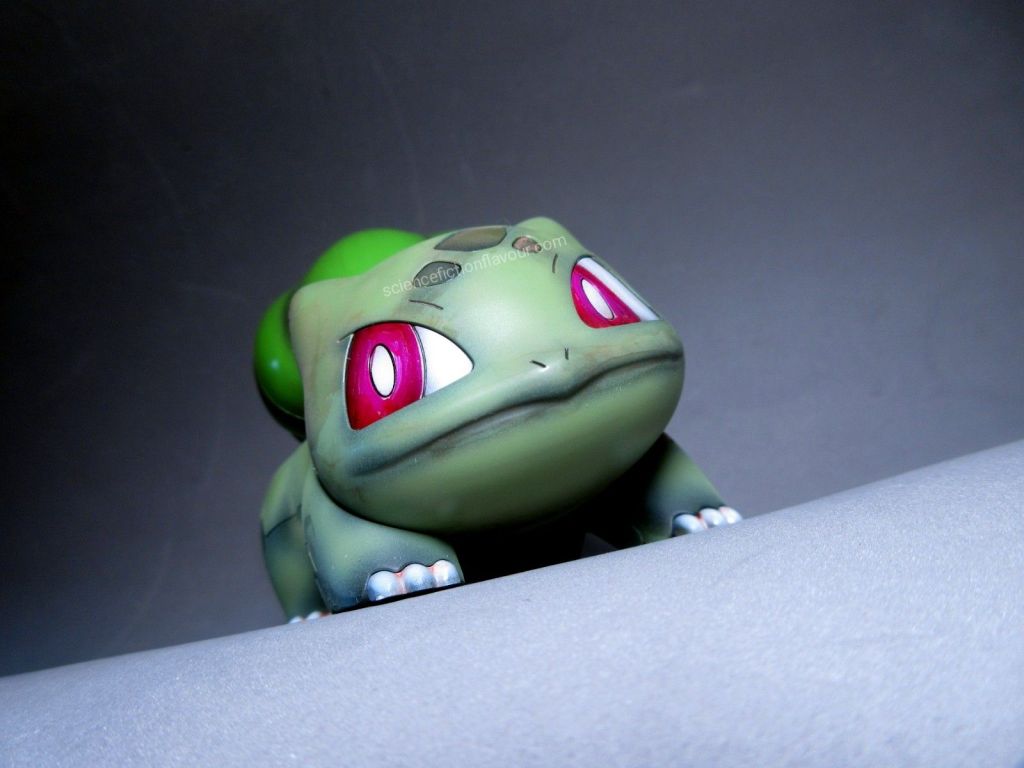
This build of the Bandai Bulbasaur plastic model focused on depth, tonal variation, and precise surface control. The goal was to elevate a simple kit into a cohesive, visually dynamic piece through careful layering, panel detailing, and considered adjustments.
Base and Body Layers Each part was first coated with a dark base to establish natural shadows and underlying contrast. The body sections were then airbrushed using three distinct shades of green — Mr. Hobby Mr. Color No. 64, 303, and 605. Layered application preserved subtle hints of the darker undercoat, preventing the finish from appearing flat and giving the model a more dimensional presence.
Whites, Reds, and Eye Detailing White and red components were finished in semi-gloss for clarity and restrained shine. During the eye detailing stage, a slight freehand overspray caused some white to mist into the red area. Rather than stripping and repainting, the section was corrected using a dark pink marker. The resulting dark-pink-and-white combination added a softer character to the eyes, complementing the overall finish.
Panel Lines To enhance sculpted details, Tamiya Accent Color Panel Line (Black) was applied carefully into recessed lines. Excess wash was removed using enamel thinner and a cotton bud, leaving behind controlled definition that sharpens the contours without overpowering the softer paint tones.
Final Assembly and Reflection Once fully cured and assembled, the model feels cohesive and balanced. The interplay between layered greens, subtle shading, and refined panel lining elevates the kit beyond its base form. Minor adjustments along the way — such as the eye correction — became part of the build’s character rather than setbacks. This build demonstrates how patience, layering, and small course corrections can transform a straightforward kit into a polished, display-ready model.
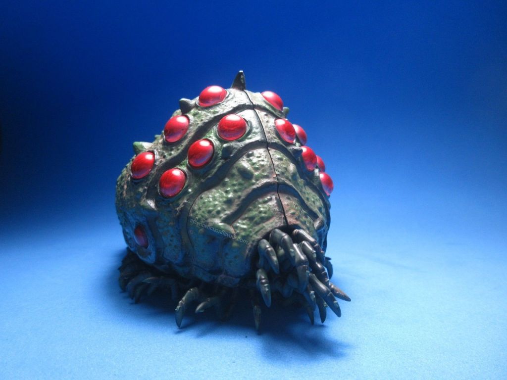
Bandai’s 1/20 Ohmu from Studio Ghibli was completed today, coinciding with Hayao Miyazaki’s 85th birthday, a fitting tribute to the creature’s origin.
Painting & Weathering: All parts were base-coated with dark hobby paint, then airbrushed with plant-green paint to add natural shading. Tamiya Panel Line Accent (brownish-red) highlighted crevices, giving an organic, weathered appearance. The clear orb-like eye parts were first coated with a silver marker and then layered with transparent red hobby paint, creating depth and a soft glow.
Assembly: Sides, base, and optic units assembled smoothly. The legs and other limbs, totaling over 50, required careful attachment. The final result is a fully articulated and visually dynamic creature.
Reflections: Pre-painting parts simplifies assembly and ensures consistent weathering. Silver under transparent red produces realistic glowing eyes. Patience is essential when attaching repetitive parts, but the visual payoff is significant. The finished Ohmu serves as a miniature homage to Studio Ghibli’s imaginative creatures.